The Writer's Room

Design, Development, Usability Test
Collaborators:
The Writer’s Room is a community of creative storytellers that offers a space for Nigerian writers to learn, grow, connect and share their stories. The community started on Instagram and is run by Nicole.
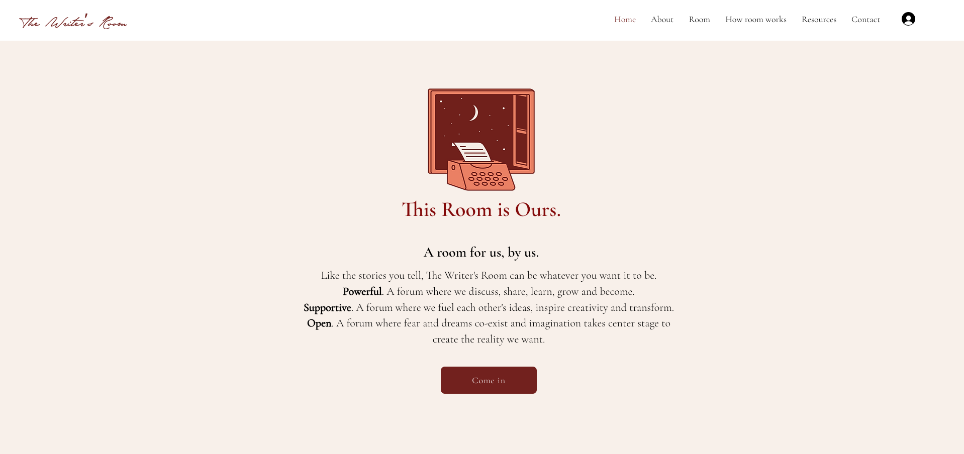
The Writer's Room cover Image
Project Goal
The projects goal was to create a forum-style website tailored for long-form and in-depth discussions. The community had an existing brand identity in place and needed a website with a minimalist design and an easy-to-use forum.
My Role
I designed the website’s interface on Figma, built the designs using Wix, and organised a usability test research to understand how easy it was for people to use the forum.
Approach

Brand Identity

Before Nicole considered building a forum, she worked with Abiola, a brand designer to create a visual identity for the community. He designed a logo, chose the brand colours and selected Gourmet Le French Script for the typeface, suggesting a toned-down and sleek feel.

Design

I started my design process by creating a site map to help us define the website’s layout. The site map consisted of:
- a landing page introducing visitors to The Writer’s Room
- an about page explaining the mission
- a room which is the forum for discussions
- a how to use the room page which was introduced after user testing
- a resources page
To give the site a minimalist feel, I explored typefaces that match Gourmet Le French Script and paired it up with Cormorant.

Building on Wix

Wix was very intuitive to navigate and I didn’t need to watch any tutorial videos before implementing the website designs. All the functions were properly labelled, and I was a google search away from an answer to any problems I encountered.

I used Wix to build the website because Nicole had worked with it in the past and she thought the admin dashboard was designed well enough to help her manage and monitor user activity on the forum. It was also a cheaper alternative to setting up and maintaining a custom forum.
Usability Test

Objective

From the project's inception, we acknowledged the significance of creating an easy-to-use forum. Our aim was to prioritize the seamless user experience for both writers and the moderating team of The Writer's Room

Approach

To kick-off the forum with organic content and gather reliable feedback, Nicole reached out to writers who had attended a recent workshop organized for the community. Ten (10) of them signified an interest in helping us with the website’s initial launch phase.

Tasks

I designed a series of tasks to gauge the ease of navigation and interaction within the forum. These tasks included:
1. Creating an account
2. Changing display name and profile picture
3. Leaving a comment under a post
4. Creating a new post under any categories
5. Suggesting additional categories on the forum for consideration

Feedback Collection

To assess the usability of the forum, I created a structured feedback form using Airtable. This form allowed us to understand the users' experience and any challenges they encountered while completing the tasks.

Results and Insights

Remarkably, all ten writers were able to successfully complete the assigned tasks without encountering significant difficulties. This positive outcome affirmed that the forum's usability met our goals and provided a seamless experience for users.

Conclusion

Based on the outcomes of the usability test, I consider the test a success. The feedback collected highlighted the effective user experience of the forum, giving us confidence in its functionality and user-friendliness.

Nicole suggested creating a page on the website with instructions, similar to the tasks I set for the test for newcomers to help them navigate the forum and start contributing to it.
How room works page
Challenges
The most tasking part of designing the website was figuring out how to organise the Resources page. The resources are a growing list of classic movie scripts and writing materials, and it was necessary to structure the page in a way that made it easy to browse through. Wix doesn’t have a function for searching within a page, so I decided to use anchors within the page.
Anchors make it easy to jump to a specific part of the resources without having to scroll much
Another issue I had was having to use my eyes to measure most of the content alignment because I couldn’t find any function to show me the height difference between blocks.
Takeaway
I learned to create a handoff document detailing everything The Writer’s Room moderating team will need to navigate the website. This document will also give me clarity in a situation where I need to troubleshoot a problem in the future.

Want to work together?
Send me and email!