The product is divided into three (3) parts:
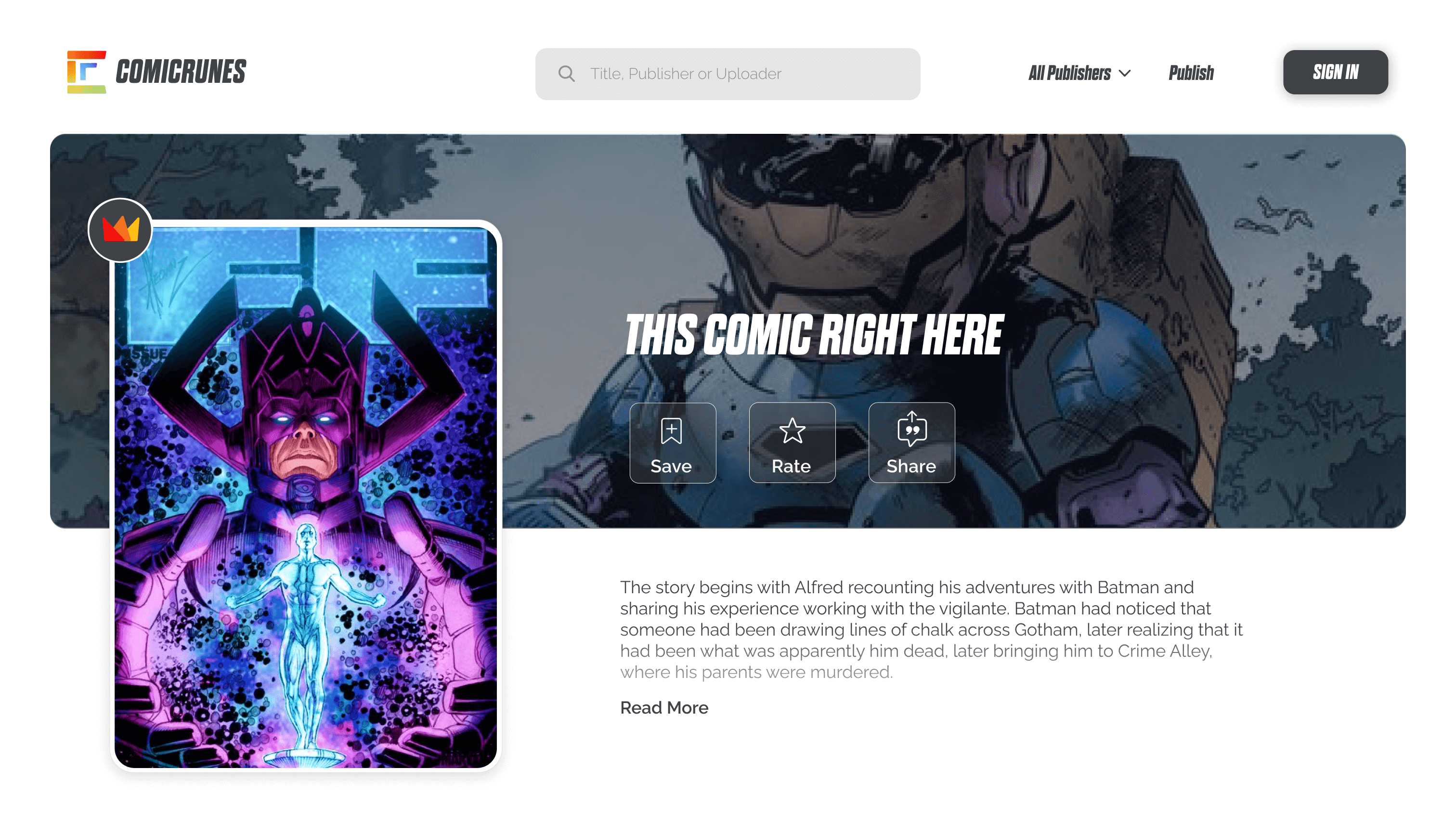
- The public website where users can browse through and read their favourite graphic books
- The dashboard : an internal tool to manage graphic books, upload graphic book information, and oversee every aspect of the site.
- The creator’s portal ; where the graphic book creators publish their work, see their metrics and analytics, and manage how readers interact with their content.
After creating Product Requirement Documents (PRDs) and User Stories, we employed the agile software development practice to design and develop the dashboard first because it’s the backbone of the product.
Branding and Design System
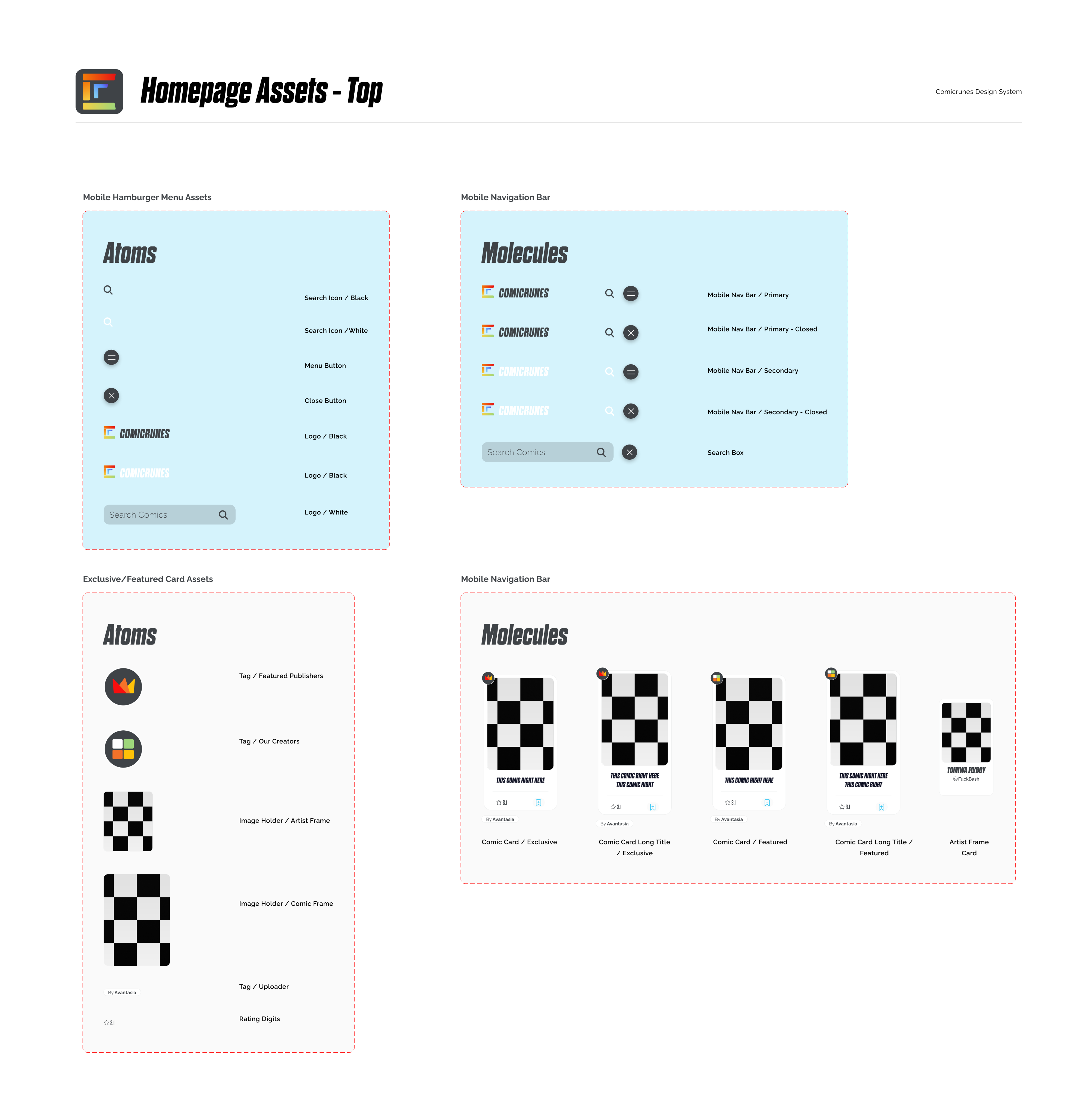
Vanny established the brand’s identity by designing a logo, selecting appropriate typography and colours, and crafting a design system with custom elements to ensure visual consistency throughout the product.

Design System
Dashboard Ideation
I focused on defining product requirements and ensuring a seamless user experience, while Vanny leveraged his exceptional visual design skills to create visual concepts. The Product Requirement Document (PRD) and User Story documents I developed established the design goals and guided the engineering process, enabling the team to work together effectively and efficiently.
Dashboard Wireframes and Concept Design
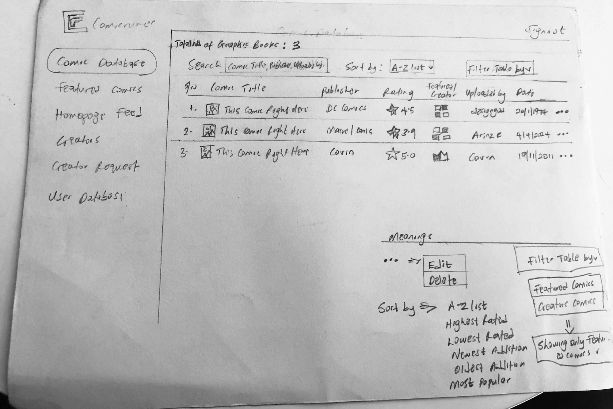
I created sketches for each dashboard page to guide the design process, and then shared these sketches with Vanny, who transformed them into concept designs.

Comic Database Sketch
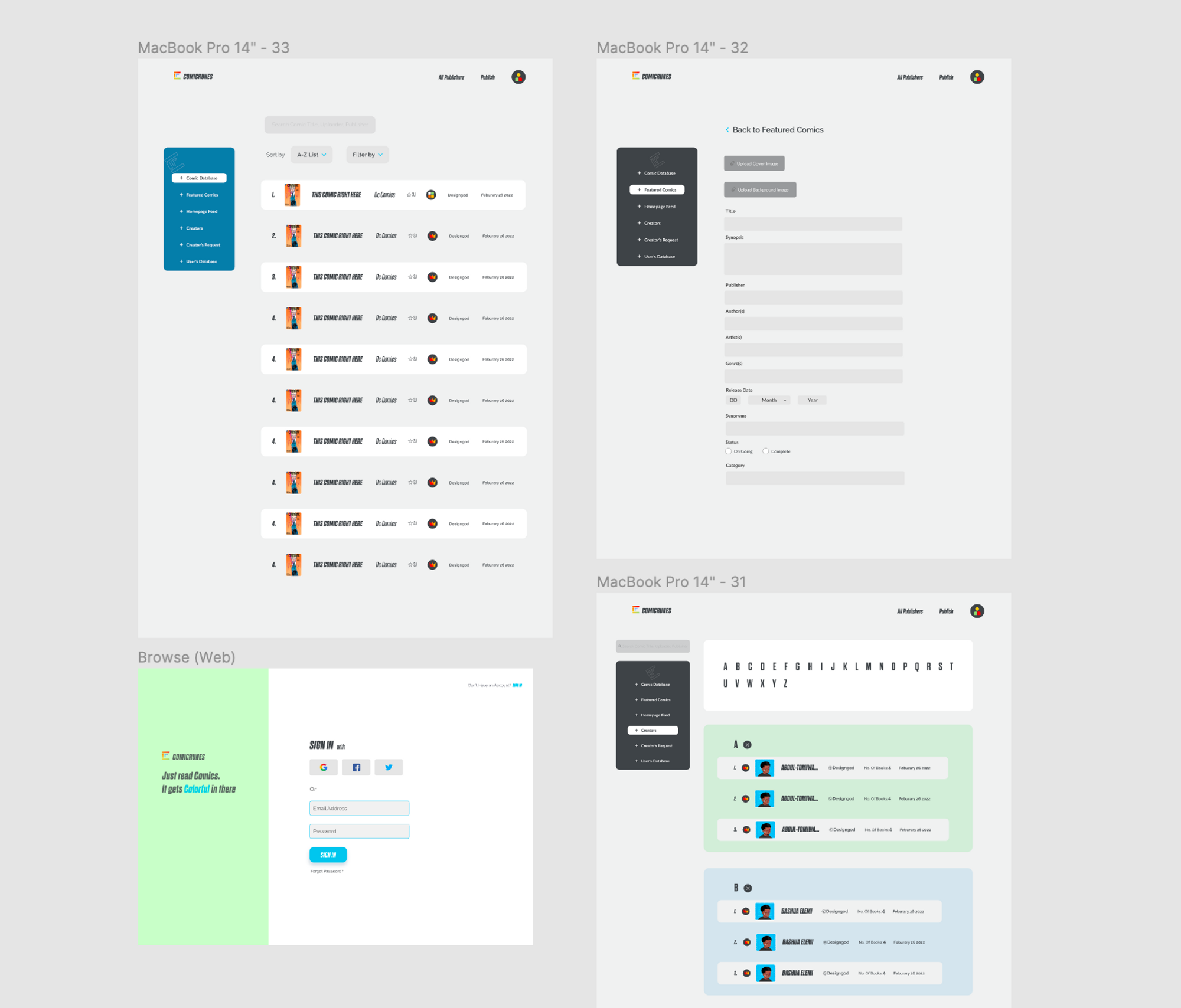
The concept designs are low-fidelity visual representations of the final product, incorporating elements from the design system. This approach ensures consistency and coherence across the various screens and sections of the dashboard.

Concept Designs
Delivering the Dashboard Prototype to Engineering
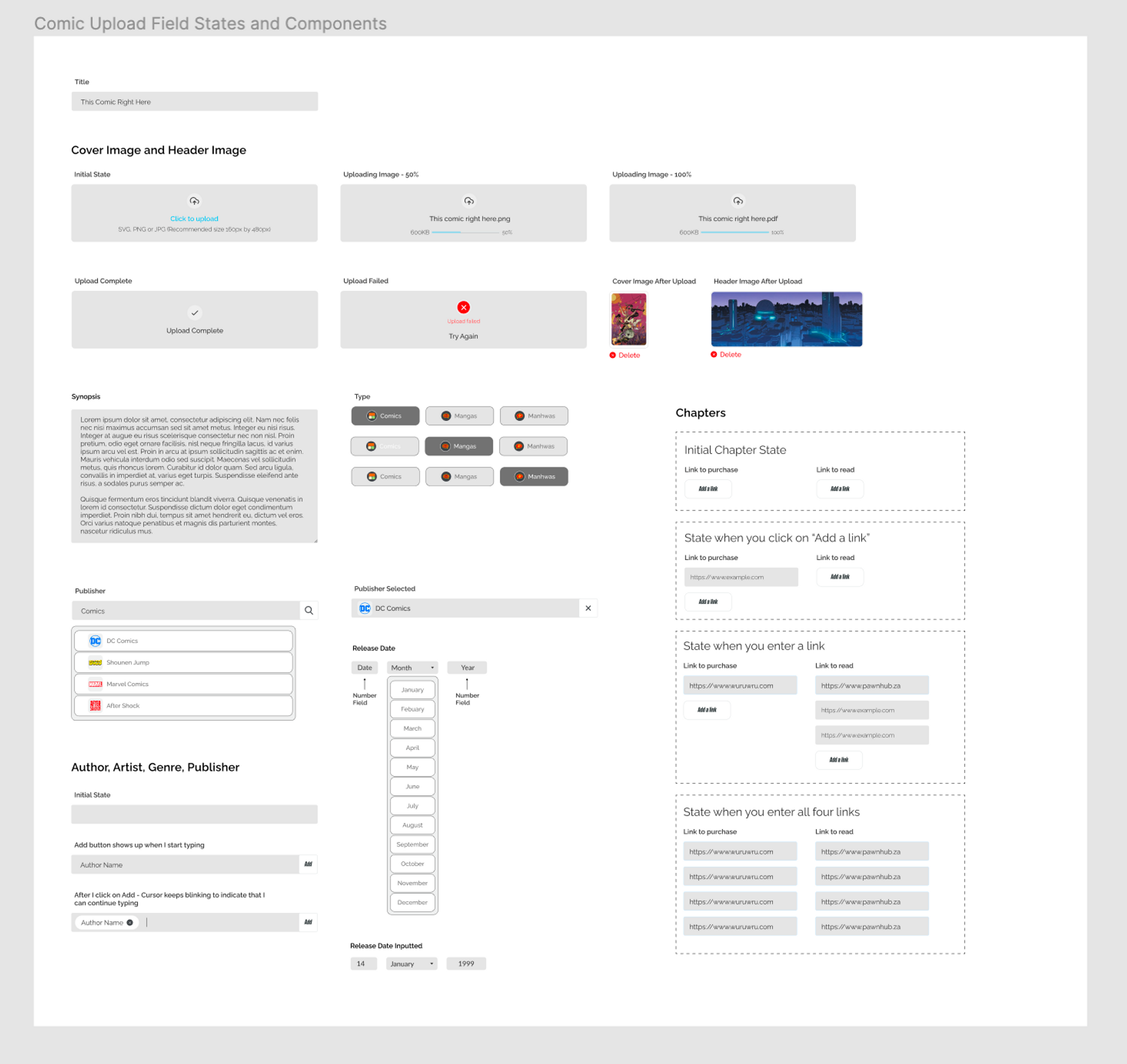
After multiple rounds of iterating the dashboard design, we successfully reached a visually appealing and functional user experience that was ready for production. To ensure a smooth handoff to the engineering team, we created distinct states on the Figma board to provide detailed descriptions for each state. This facilitated a clear understanding for the engineers about the expected behaviour at every point of interaction with the product.

States in the comic upload flow
